Oops! Looks like your device is too small to view this page. Please try on a larger device!


PROJECT #3 - VITAMIN ME
A multi-purpose mental health & wellbeing app.
Creating a multi-purpose mental health app that encourages habit building and engaging in positive self-care practices.
FOCUS
App Design
ROLE
UI/UX Designer
TIMELINE
4 weeks
01 - INTRODUCTION
Journaling has become a major hobby of mine throughout the past few years, as it allows me to reflect on
the events happening around me and practice introspection on an almost day-to-day basis. However, I
often struggle to maintain it as a daily habit.
Additionally, I am always looking for new positive habits to develop in my life (expressing gratitude,
meditation, yoga) in easy, accessible ways, and so I find mobile apps to be powerful for these reasons.
However, I find that many mental health apps have a specific practice or habit that is highlighted in
their products, and can only be accessed through the use of the internet or mobile data.
This project was an investigation into mental health apps, and the process of creating a functioning web
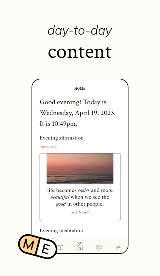
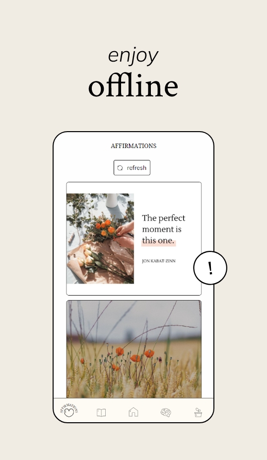
app using HTML, CSS and JavaScript. The final design is Vitamin ME, a multi-functional offline
well-being app that was created to create an all-in-one experience for users, that incorporates multiple
self-care and well-being activities into one platform.
Framing the issue
For this project, I decided to create a multi-purpose health & well-being app that allows users to engage in various activities that contribute to mental well-being.
How might we develop a mental health app that encourages and promotes various self-care habits such as meditation, writing and focus?
02 - UNDERSTAND
Conducting research
To incorporate research findings into my final design, I conducted a short 20-minute observation in a
hypermarket, following the 5 human factors method to take my notes: physical, cognitive, social,
cultural
and emotional. While these two are vastly different industries, through this experiment I was able to
observe user flow in the setting of a physical store, and analyze how people typically spend their time
in a hypermarket, helping me acknowledge different types of user flow and allowing me to create more
diverse user flow charts for this project.
Upon conducting the 20-minute observation, I gained the following insights to apply to my app:
- Design for all possibilities: The consumers’ flow in a hypermarket is semi-structured. Ideally, it begins with “enter the superstore” and ends with “pay for items” and “exit store". However, what consumers do in between those actions are entirely unique to the consumer. In a digital setting (ie. an app), the more content there is, the more flexible and more possible user flows there will be. Thus, no matter what users do in between their time of “enter the app” and “exit the app”, I must design for all possibilities and experiences.
- Endless user goals: Many people seemed to have different goals when entering the store: it’s important to consider this when developing the structure of my app as well. For example, some may download it just to test it out, while others may download it mainly for a specific feature.
Identifying the users
Using the findings from the ethnographic research, I created two personas representing two different bodies of people: people who currently practice or have practiced mental health habits in the past, and people who have no experience but would like to begin developing self-care habits. These personas represent the general demographic of users who may be interested in similar self-care apps and products.
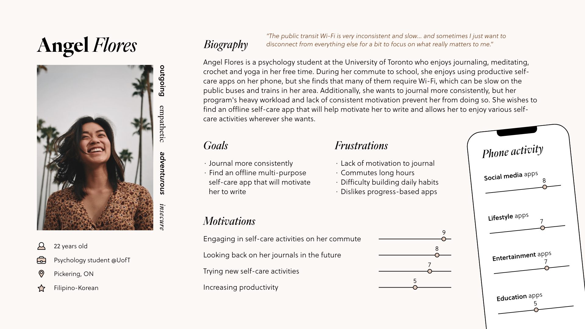
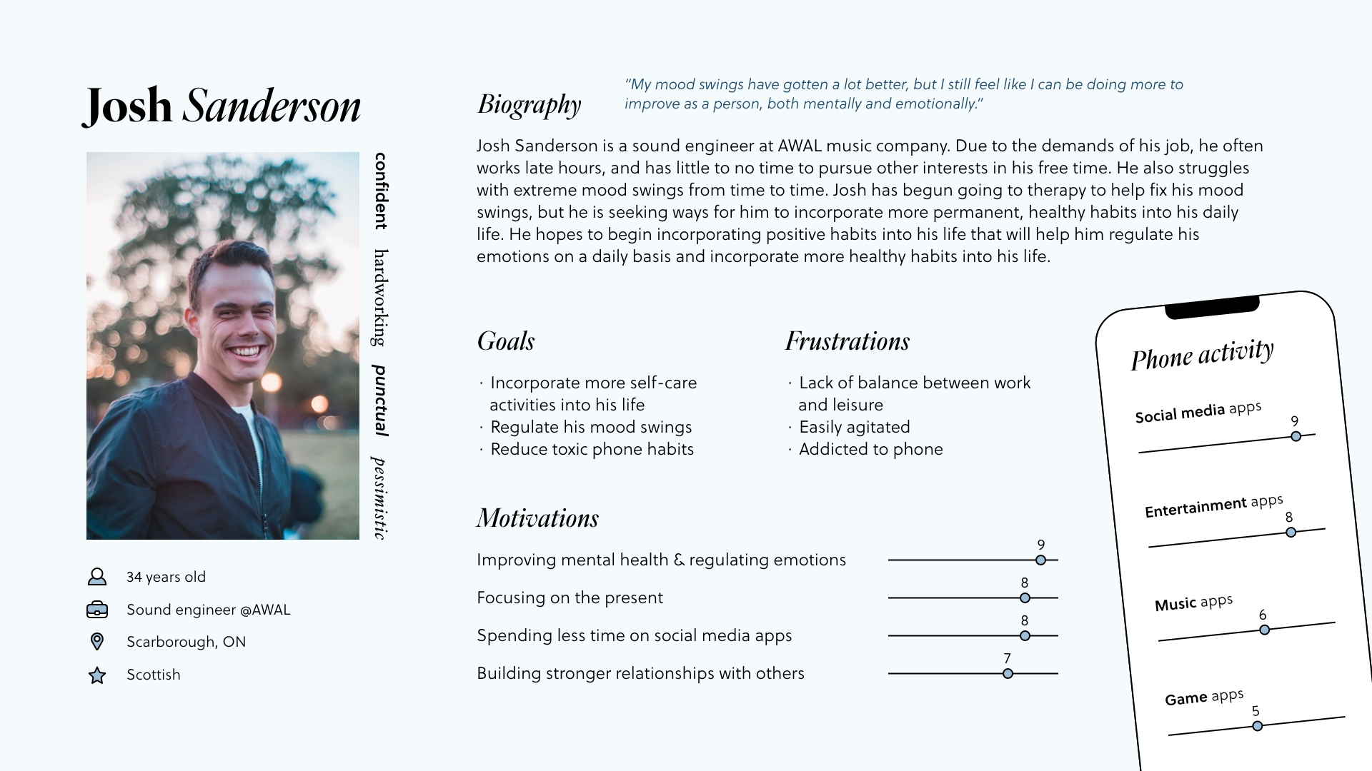
Personas
Understanding potential users’ motivations and goals in choosing to engage with a new app assists in the process of identifying key features or interactions that could be incorporated in the app.
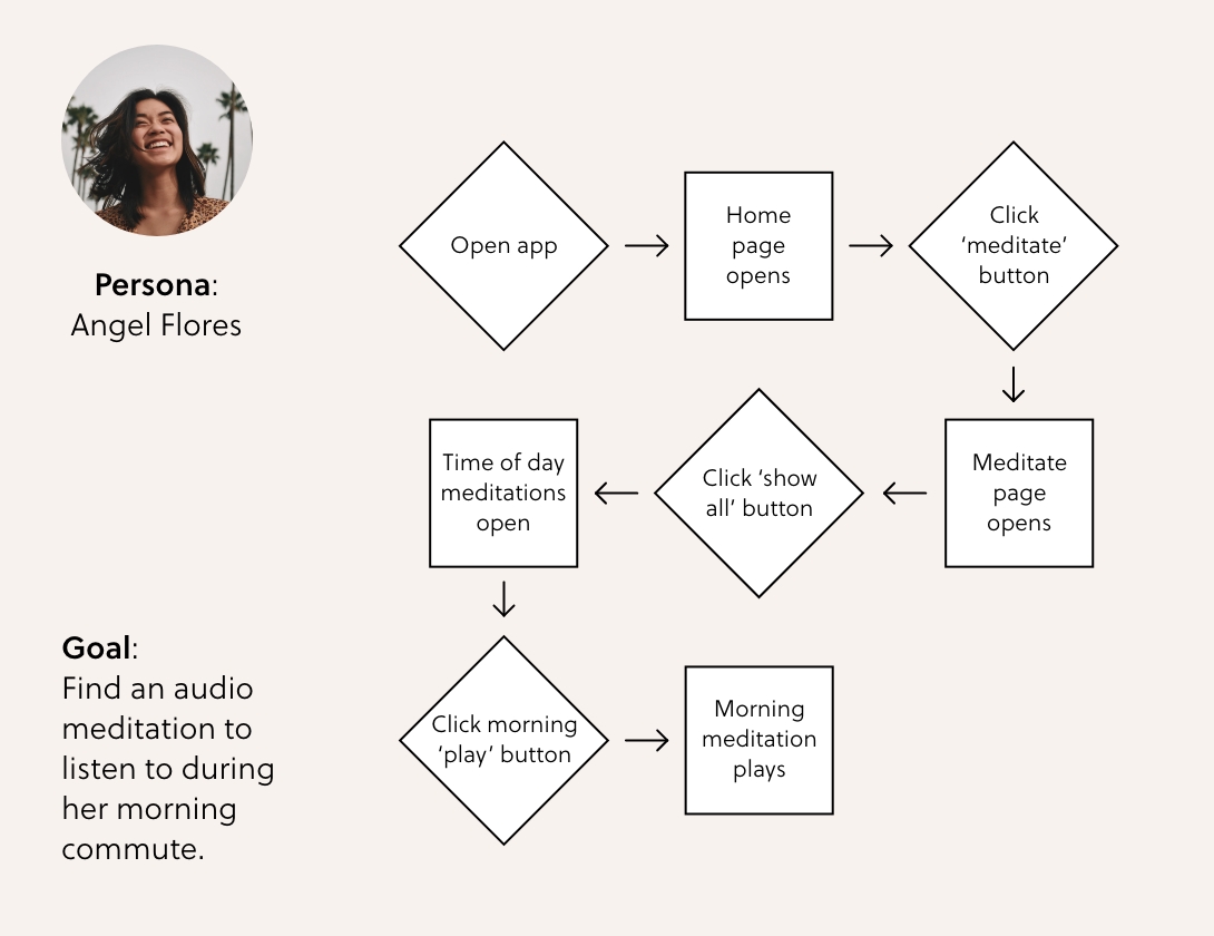
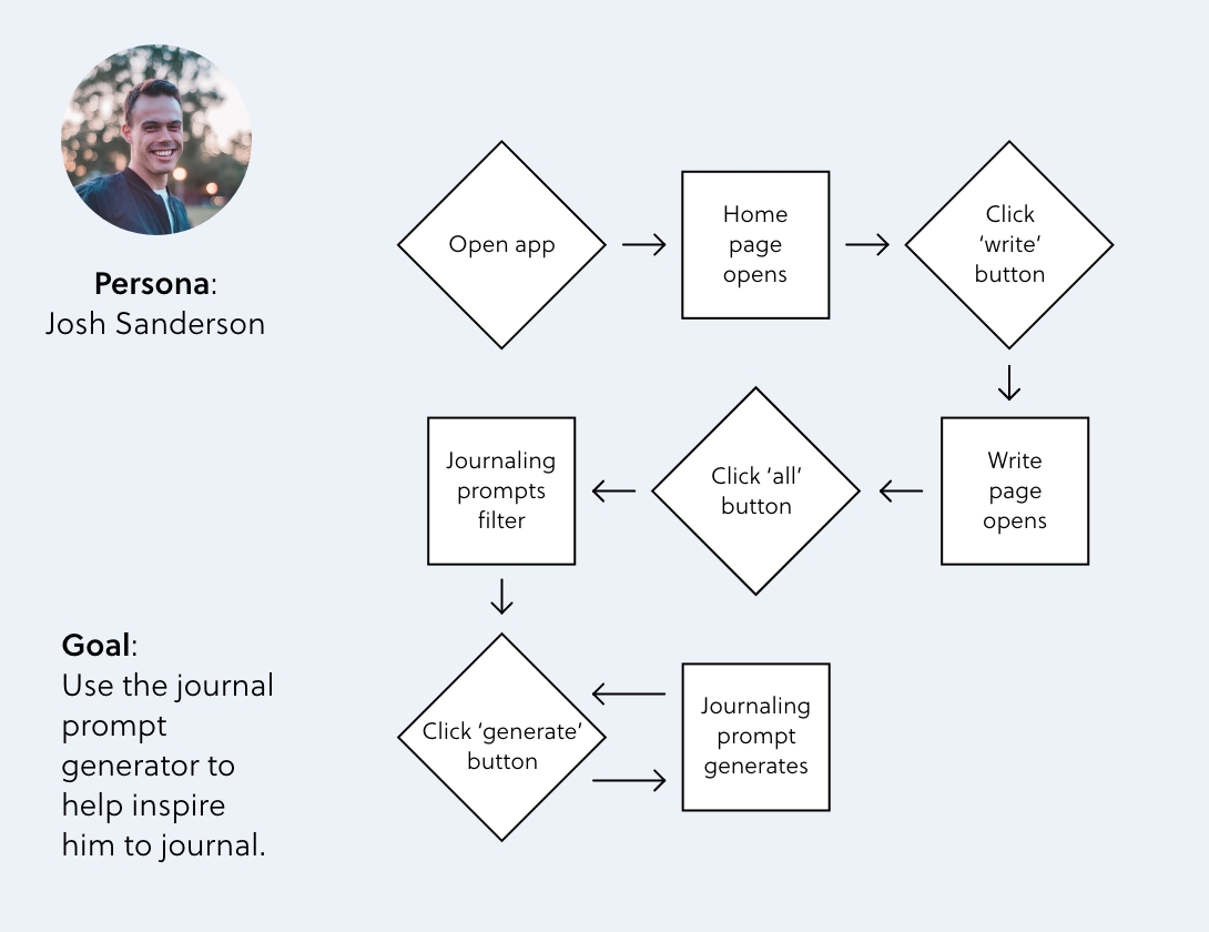
Personas' user flows
These user flows reflect the insights from the ethnographic research, while incorporating the motivations and needs of each persona.
03 - DEVELOP
Initial sketches
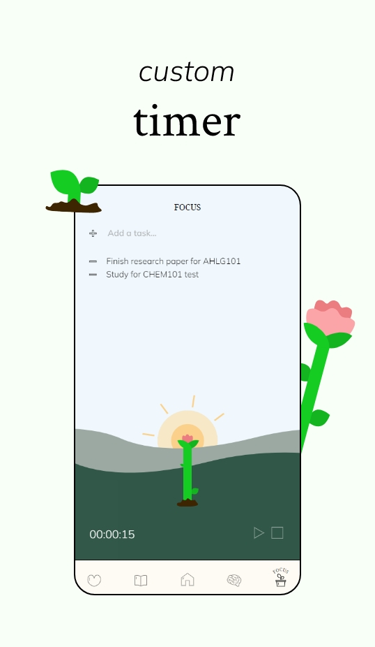
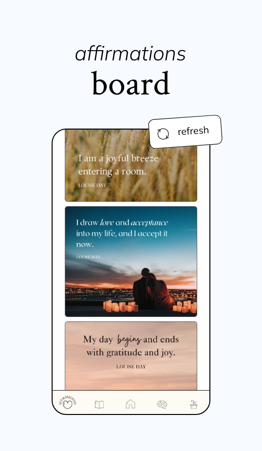
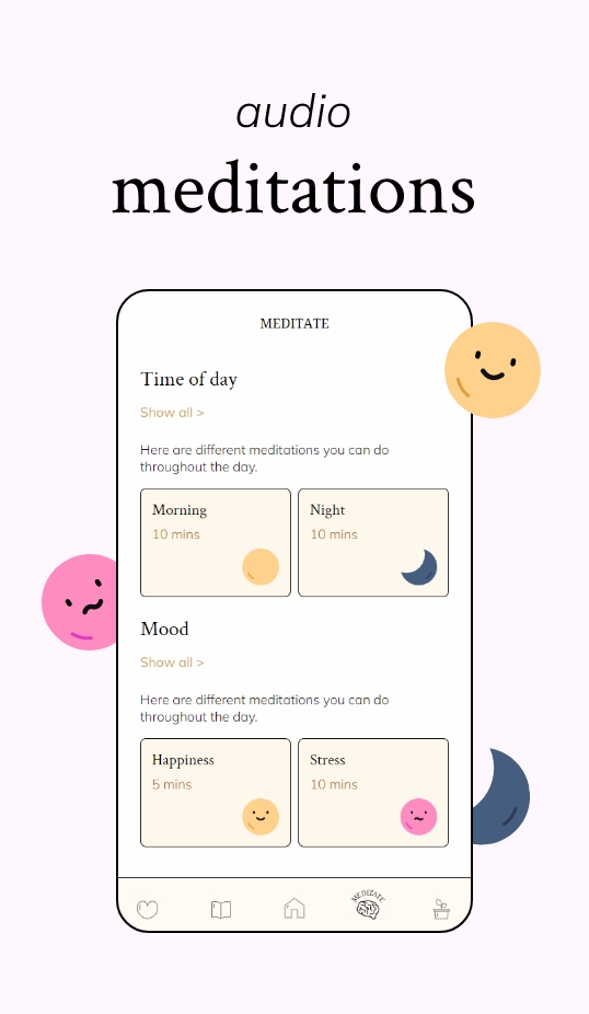
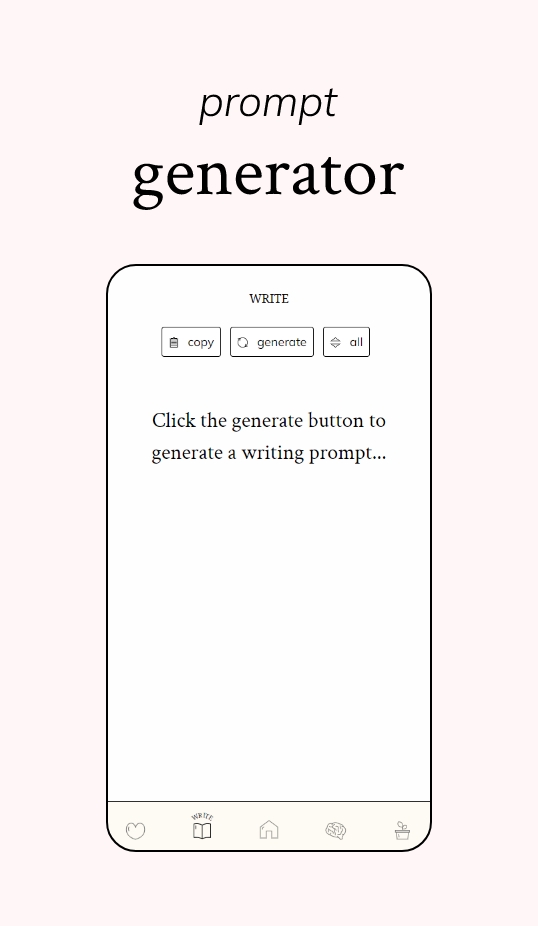
Inspired by a previous project where I created a prompt generator for writers, I decided to implement a prompt generator as well as three other features to this app: an affirmations board, an audio meditation player and a focus timer that grows a plant over time.
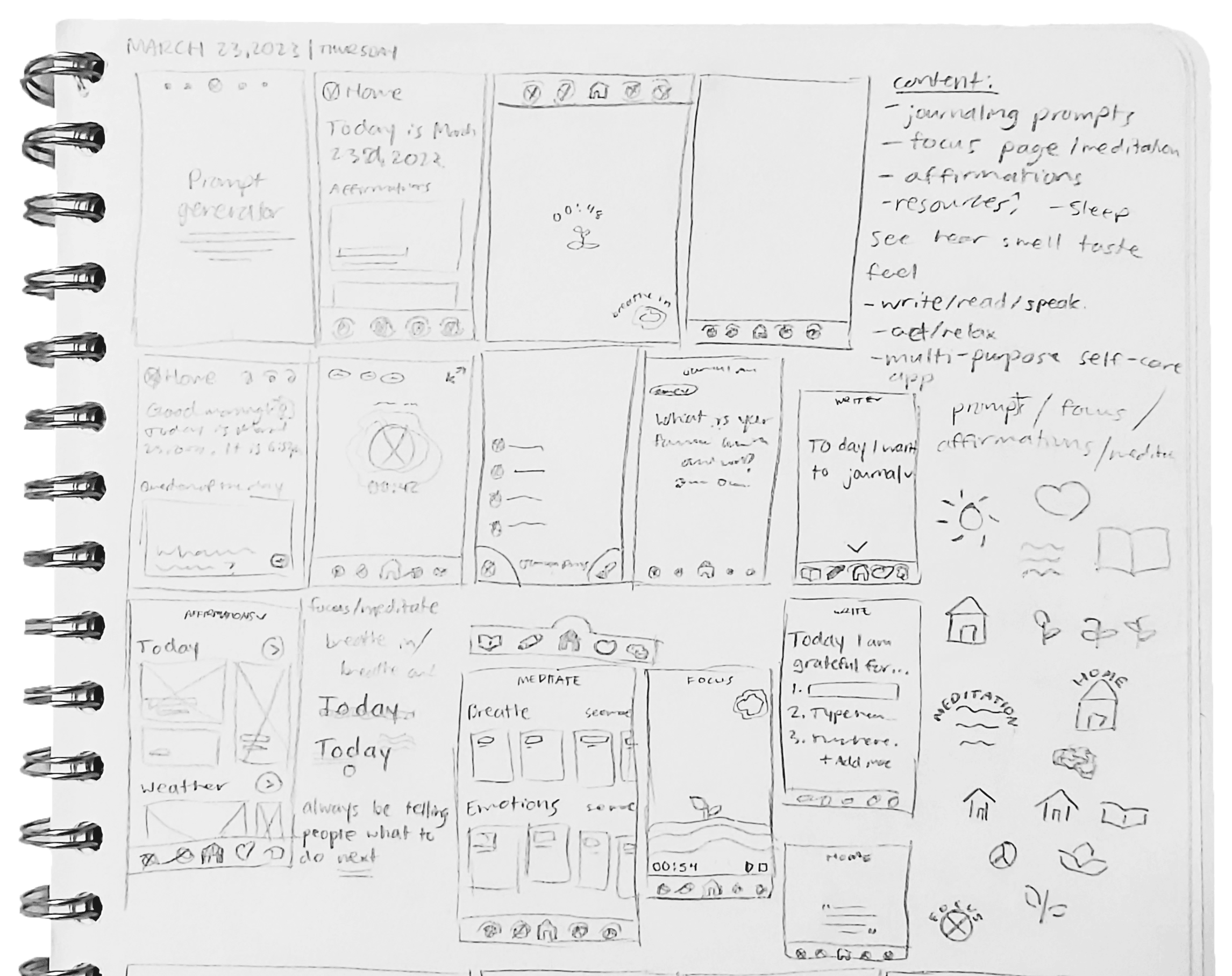
Initial sketches
These initial sketches were used to create the low-fidelity app’s icons and dynamic visual assets, created in Adobe XD.
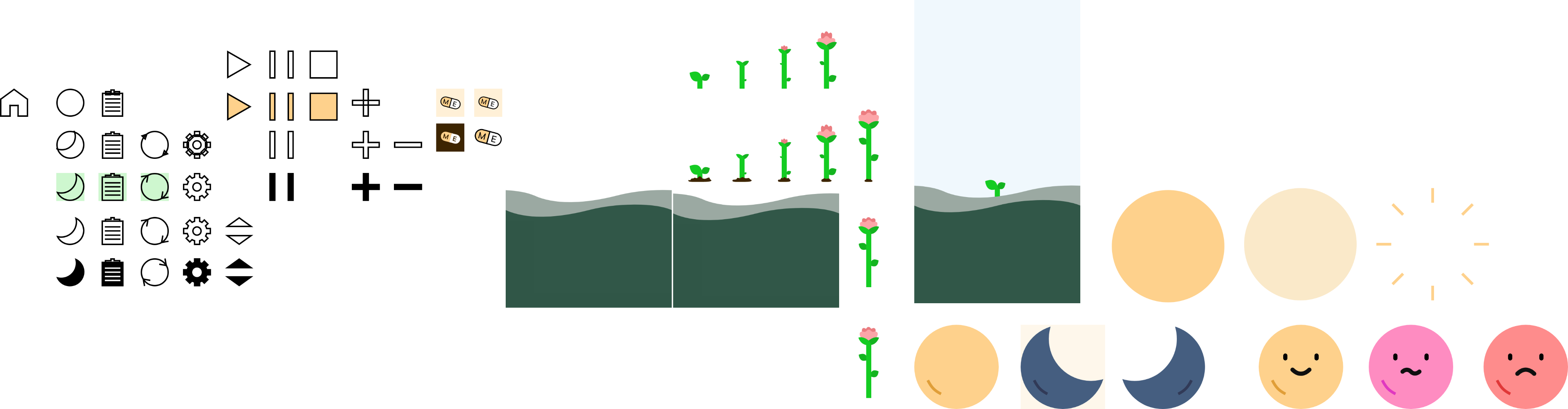
Icon process in Adobe XD
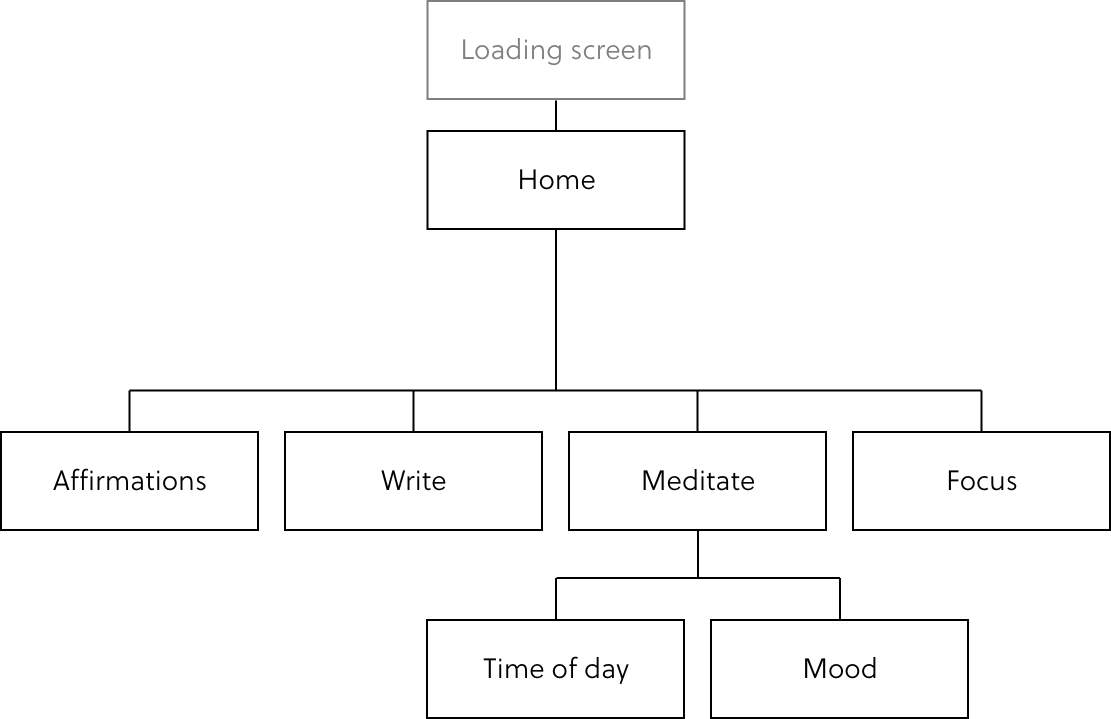
Site map
04 - TESTING & ITERATION
Usability testing
Along with the initial sketches, I also created paper prototypes of the app in low-fidelity form. Using this prototype, the mobile web app’s structure was tested with numerous colleagues from Sheridan College.
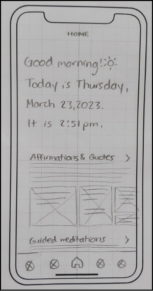
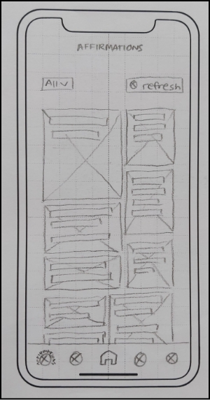
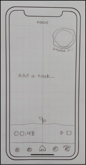
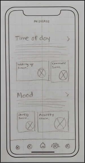
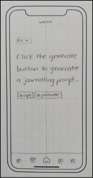
Paper prototype used for usability tests
With these usability tests, I developed some key insights about the current structure of the web app:
- Unclear navigation bar: Users didn't notice the navigation bar on the home page because there were no labels and icons to show what page they were on.
- Ineffective headings: The headings were vague, so users weren't sure where they led to or what the content consisted of.
Below were some of the goals that were kept in mind when creating and improving the design in the digital prototype and wireframes.
- Make the page location clearer: Add text in the navigation bar to indicate which page the user is on at all times, and increase the font size of the page title at the top.
- Add captions: Add captions to headings that are unclear, and add supporting content to further indicate what the content under the heading may entail.
- Create a looping experience: Add links in the home page that link to other pages in the app, instead of a subpage within the home page.
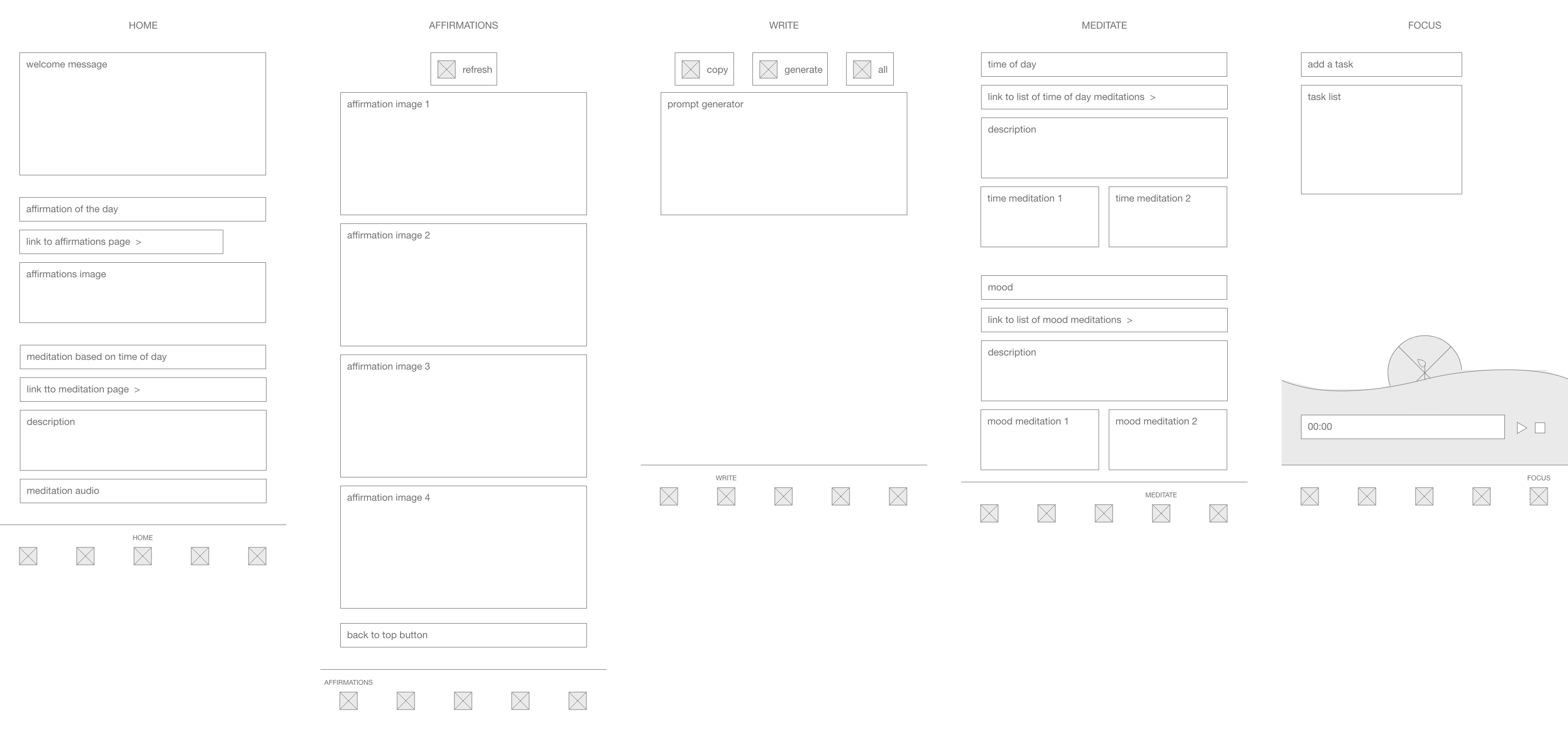
Digital wireframes
Based on these results, I recreated the low-fidelity wireframes digitally, with some changes that were
informed from the insights from the usability test.
Creating a style tile prior to developing the digital wireframes helped visually organize the app’s
brand design, and create icons that were visually consistent with the app’s existing look.
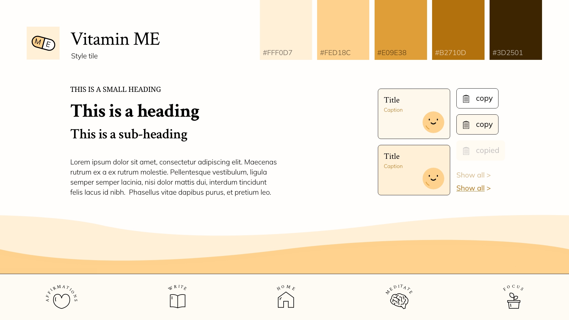
Style tile
With the style tile, the final icons, colours and fonts to use for the web app were selected, and digital wireframes were created.
LOW-FIDELITY →
MID-FIDELITY →
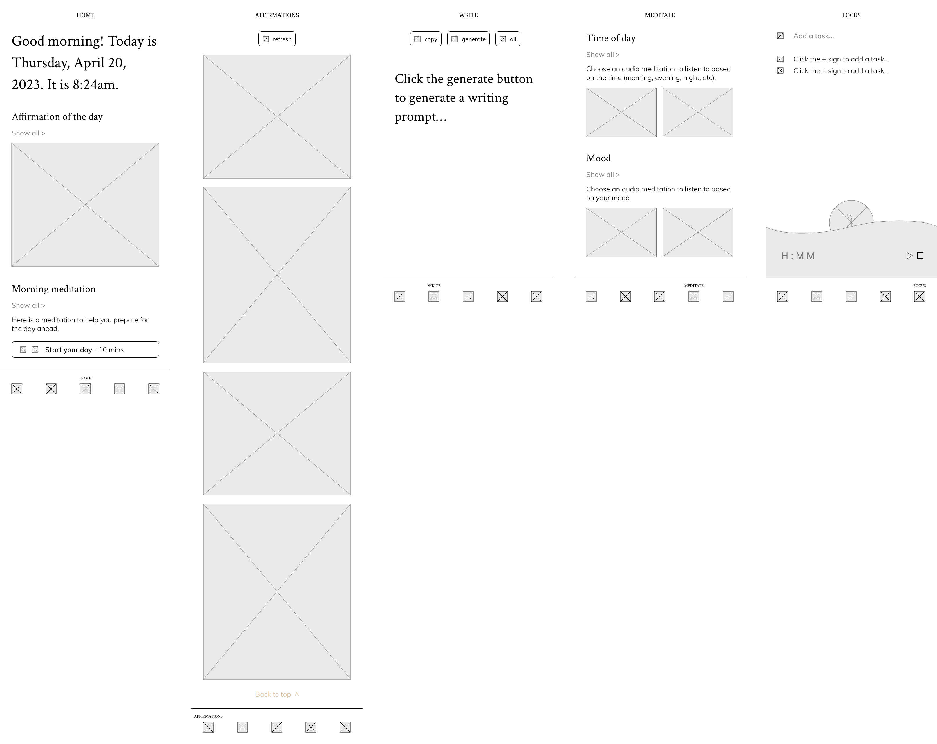
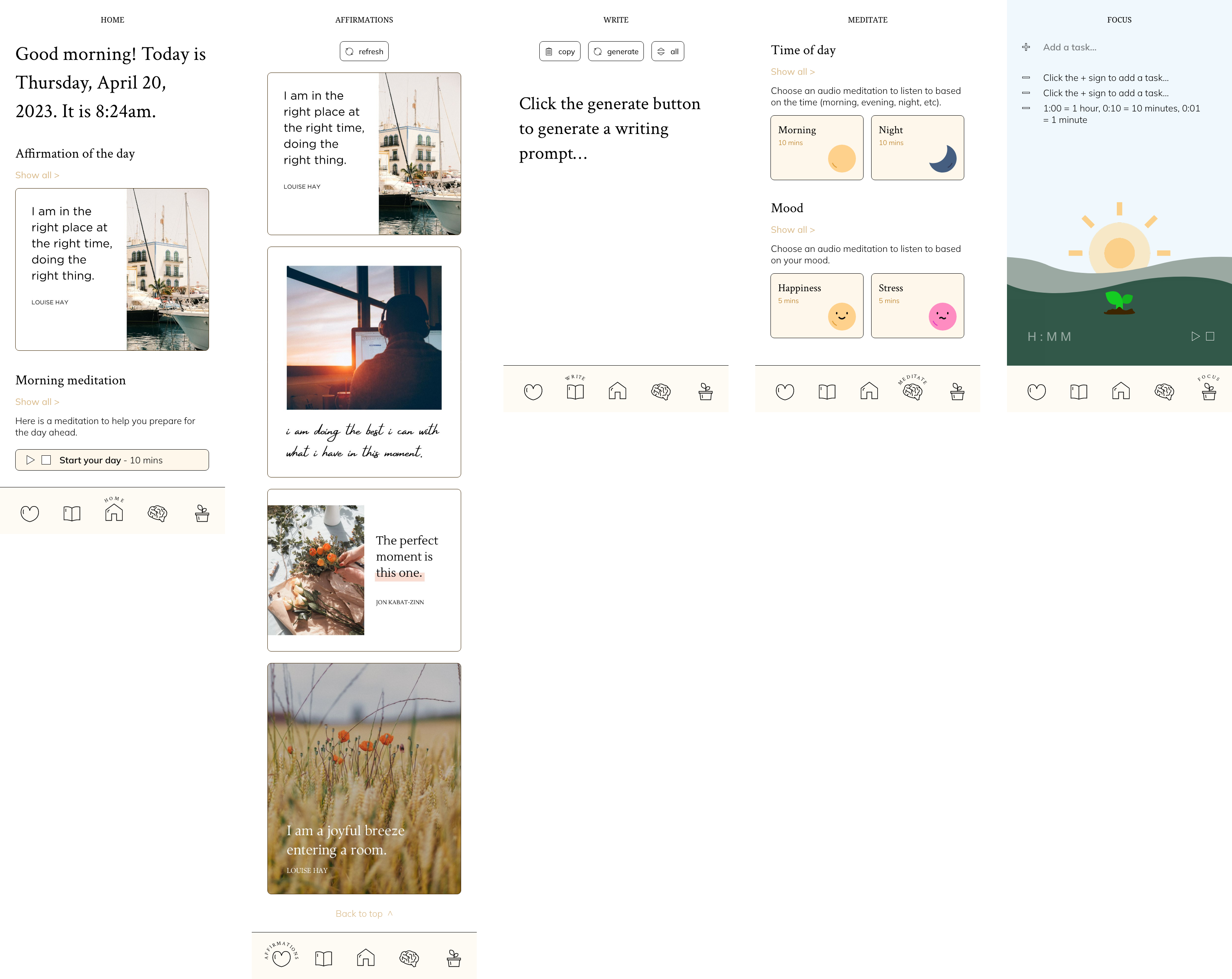
HIGH-FIDELITY →
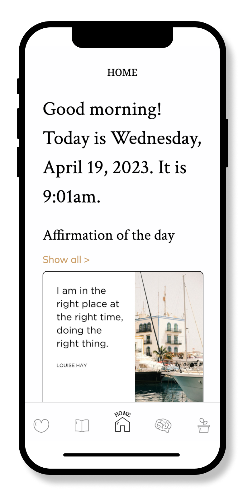
05 - FINAL DESIGN
Style tile & web app
Using the style tile and digital wireframes, I created the final web app using HTML, CSS and JavaScript. Incorporating JavaScript into the final web app allowed me to physically integrate these features.
06 - NEXT STEPS
Closing reflection
In this project, I learned how to incorporate ethnographic research from outside the industry into a design that reflects the insights and lessons learned from the experiment. I also learned how to utilize JavaScript to create multiple functioning features, including a timer, slide in animations, randomly generated prompts, and more. This project taught me the fundamentals of JavaScript, and how to apply these features into a functioning web app.
Copyright © 2024 Marina Au.


