
Oops! Looks like your device is too small to view this page. Please try on a larger device!


PROJECT #1 - BALANCE
A meditation app made more accessible to the hard of hearing.
Redesigning Balance, a popular meditation app, and improving its accessibility through the addition of various features to its meditation session interface.
FOCUS
Design Strategy
ROLE
UX Researcher, Visual Designer
TIMELINE
4 months
01 - INTRODUCTION
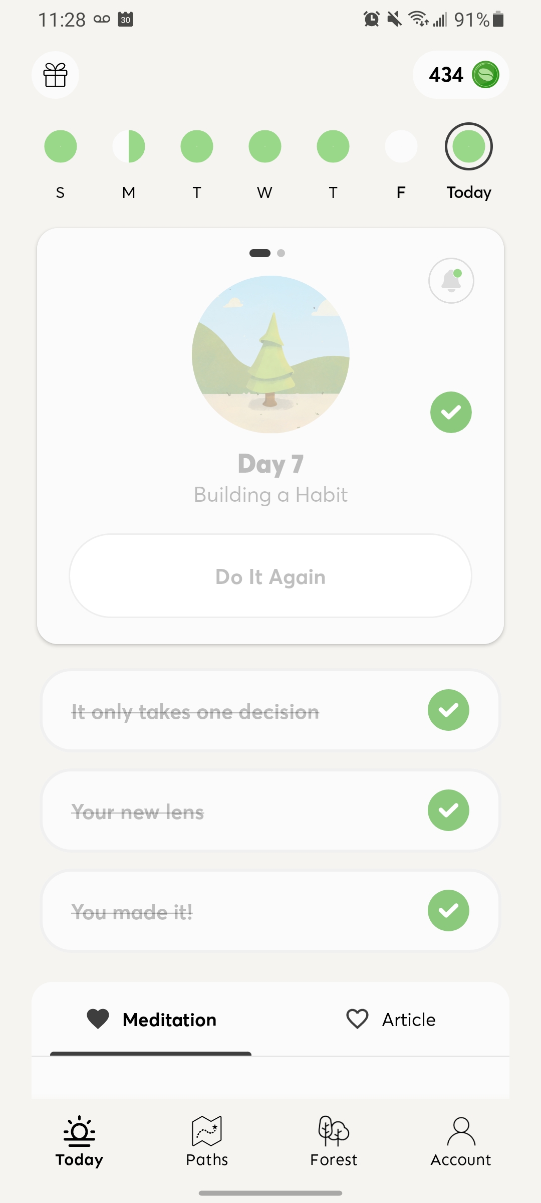
With over a million downloads on the Google Play Store, Balance is one of the leading meditation apps on the
mobile platform. Curated with playful illustrations and a soft, warming user interface and colour palette and
featuring a free one-year trial for new users, this mobile application is extensive and provides a wide variety
of meditations for everyone and anyone.
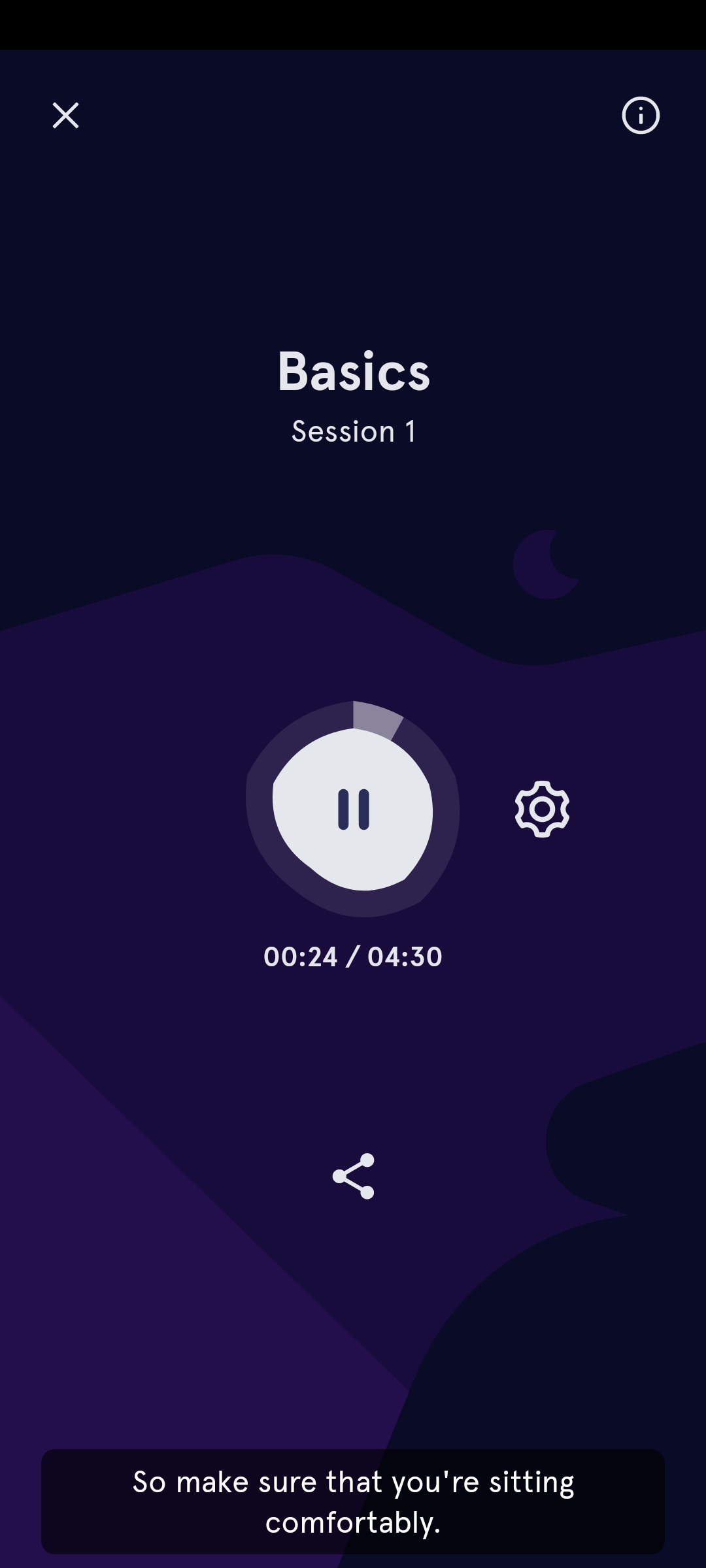
The meditation sessions themselves are minimally designed, featuring only a play, pause and skip option for the
meditation audio. This creates a rather frustrating, inaccessible experience for users who are hard of hearing
and may be facing auditory impairments. Beyond the typical home setting, Balance’s meditations are essentially
impossible for users to follow along without sound.
What if the user is on a busy bus, in a library without headphones or living with a permanent auditory
impairment such as full or unilateral hearing loss? How might that user experience the Balance app?
This project was an investigation into accessibility, and the process of defining and applying accessibility to
an existing product, enhancing its usability and overall user experience. Guided by Microsoft’s Inclusive Design
Principles, the final design is a functional coded prototype that features the implementation of Closed
Caption, Visual Aids and Playback Speed.
Framing the issue
The specific mismatched interaction that I chose to solve for this project was an individual with auditory impairments or more. With that in mind...
How might we improve Balance’s meditation sessions to accommodate those with auditory impairments and more?
02 - UNDERSTAND
What do I know?
Diving into this project, I knew from my personal experience with meditation apps that most guided meditations
were audio based, as it requires the participant to close their eyes. While some apps feature Closed Captioning
as part of their meditations, it is generally more difficult to search for guided meditations that have visual
aids.
Before continuing with the project, I decided I had to find out…
- What makes a meditation app effective, accessible and enjoyable for its users?
- How may the meditation session feature of the Balance meditation app be improved (from what it currently is) for those with certain impairments?
- What options do I have or can I create when thinking of alternative, accessible options for the meditations on Balance?
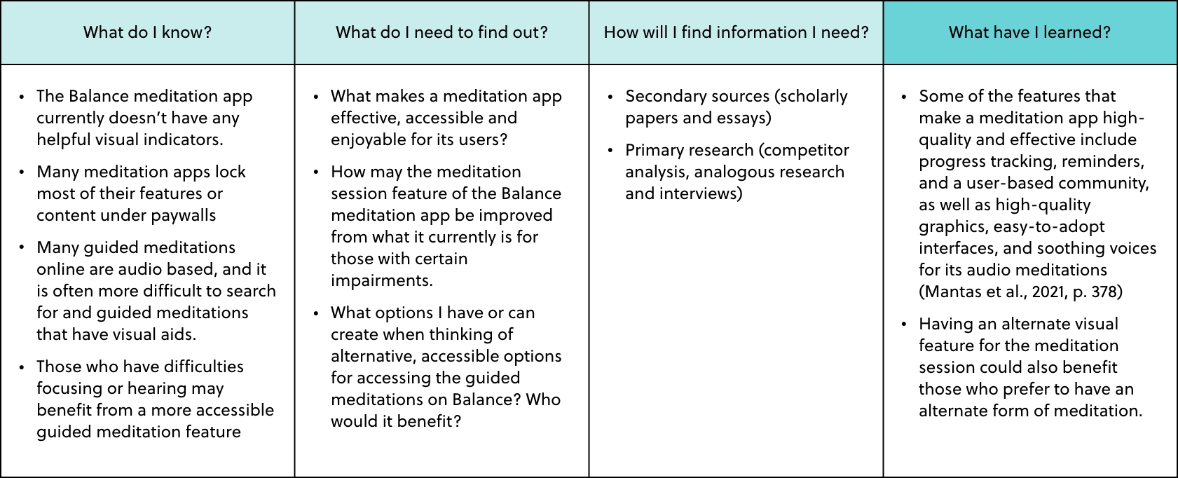
The initial questions that arose in the initial stage of this project were addressed using a KWHL table: What do I know, what do I need to find out, and how will I find the information I need? (The final question, what have I learned, would be answered after conducting research.) This KWHL table assisted in formulating a structure for my project and helped identify the knowledge gaps I needed to address before continuing with the project.
Conducting the research
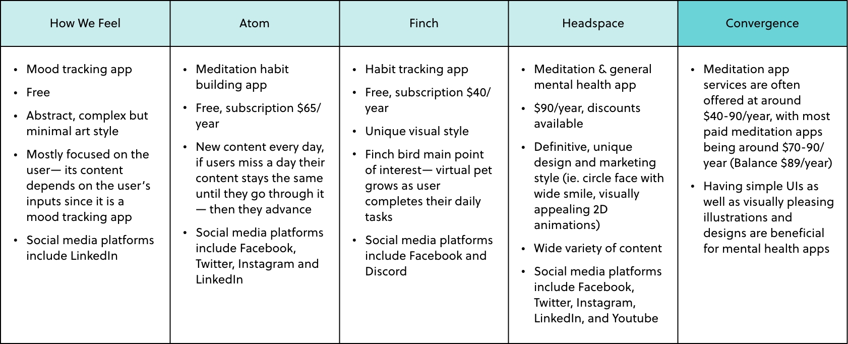
Large or small, I felt that I wanted to create a solution that was impactful and helpful to the targeted audience I was designing for. Thus, I decided to use three research methods that allowed me to get to know the users themselves and analyze existing solutions from other competitors: competitor analysis, analogous research and interviews.
HOW WE FEEL →
ATOM →
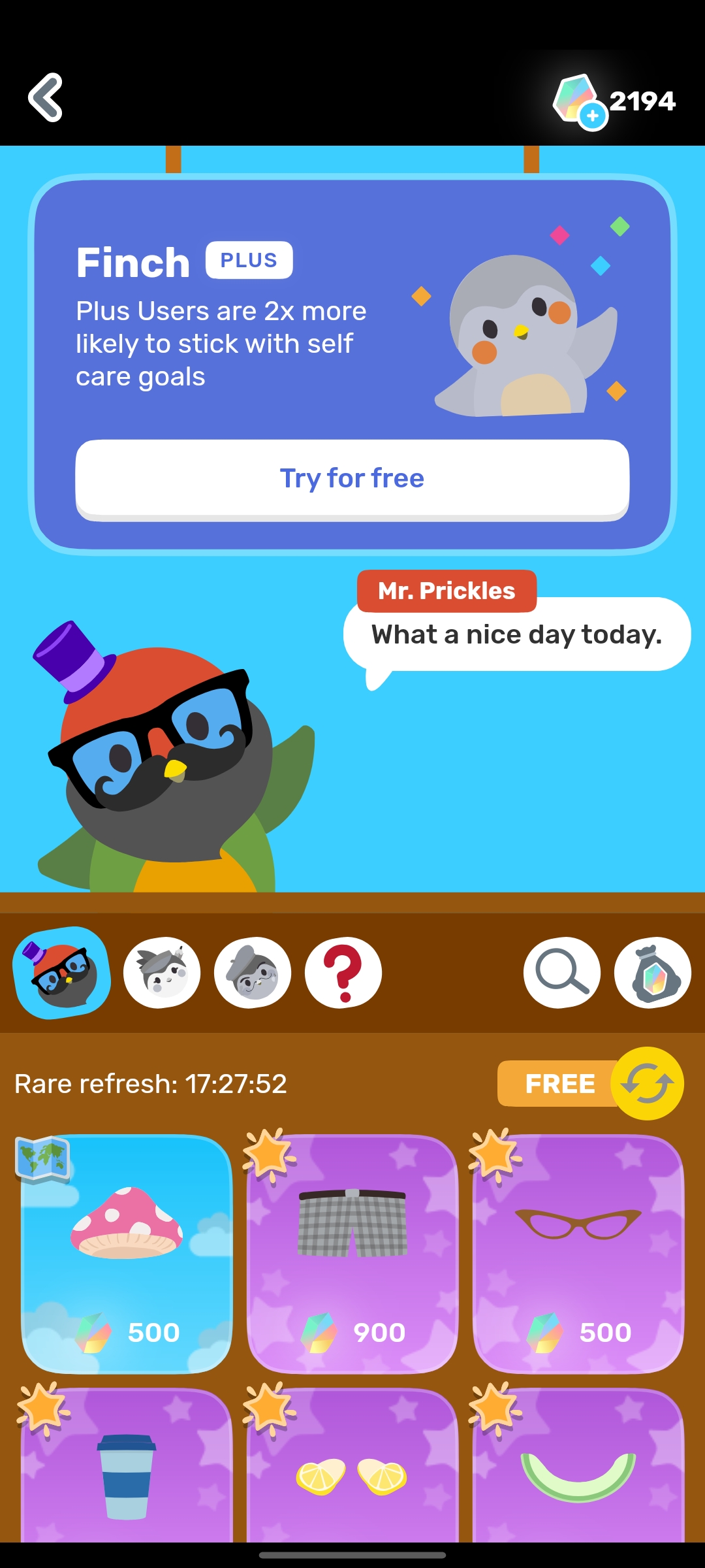
FINCH →
HEADSPACE →
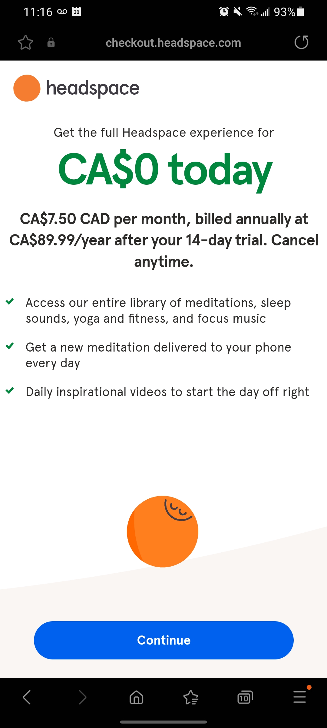
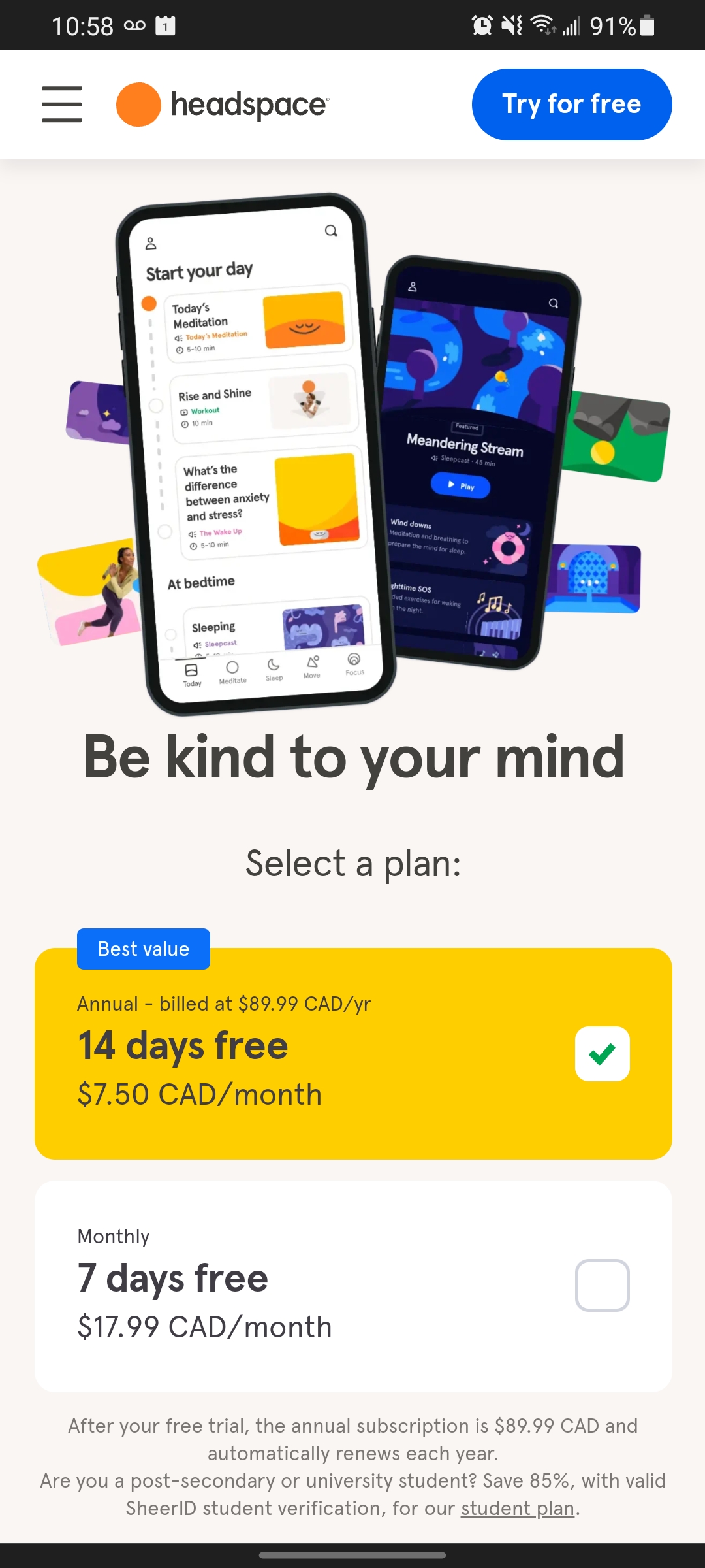
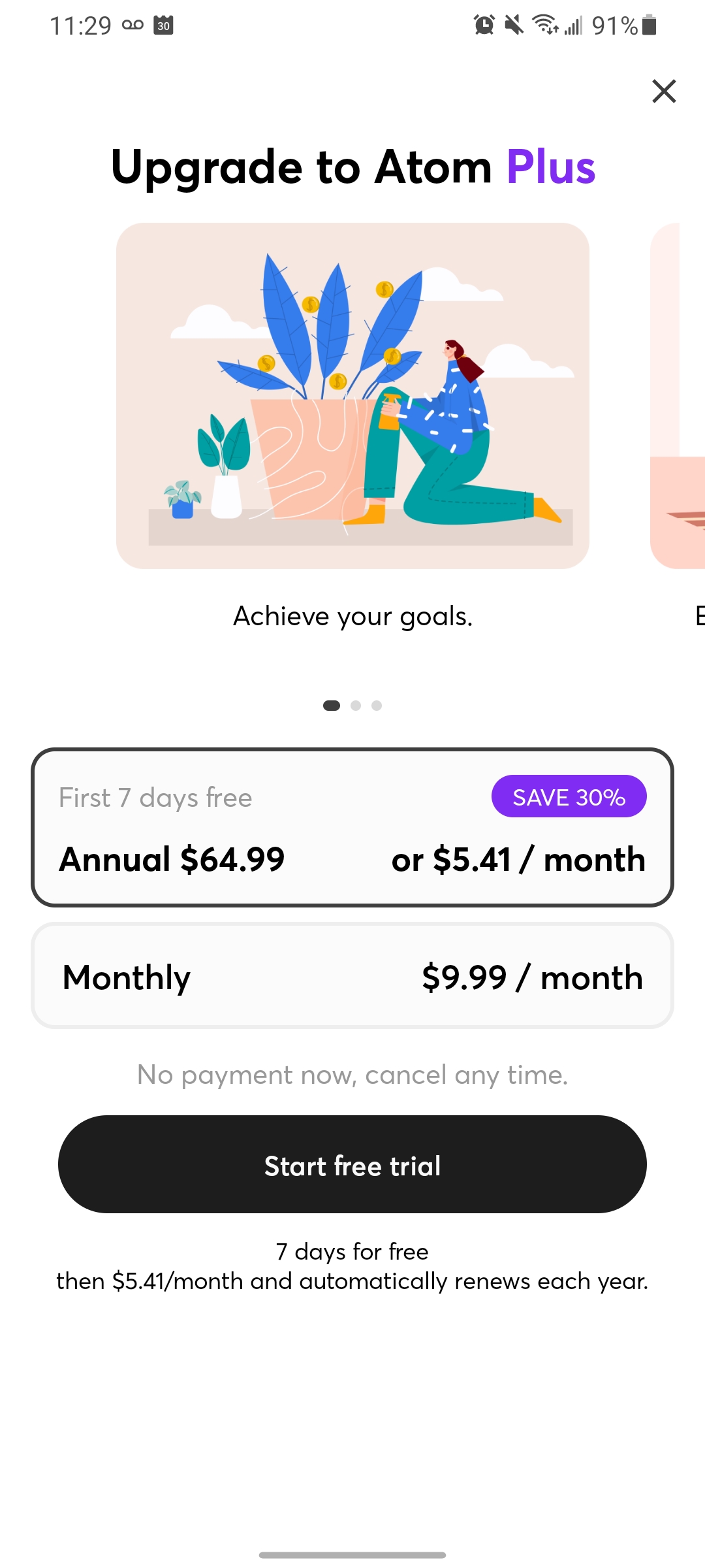
Through my competitor analysis and analogous research, I found that many paid mental health and meditation apps offer their services at around $40-90/year, with most meditation apps being $70-90/year at regular pricing. Some meditation apps also typically feature various accessibility options, such as Closed Captioning, playback speed, audio skip, and video toggle.
As for the secondary research, a brief literature review was carried out using sections from two different books (Universal Access in Human-Computer Interaction published by Springer Nature Switzerland, and Informatics and Technology in Clinical Care and Public Health, 1st edition, edited by John Mantas and more), each discussing human-computer interaction and how individuality (such as personal preferences or physical limitations) can affect those experiences.
03 - ANALYZE
Compiling & triangulating the findings
Insight #1: Visuals & functionalities
Through the user research and literature reviews, I found that people are more likely to deem a meditation app effective, accessible and enjoyable if it includes timers, tracking facilities, reminders and connection to a community. Additionally, making an app aesthetically pleasing, interactive, and high-quality in terms of its content also contributes greatly to the overall effectiveness of the app.
Insight #2: Options to improve
Some alternative, more accessible options that could be incorporated in the final design include details of the meditation, transcripts, videos, or unique visual designs that enhance the experience of the meditations.
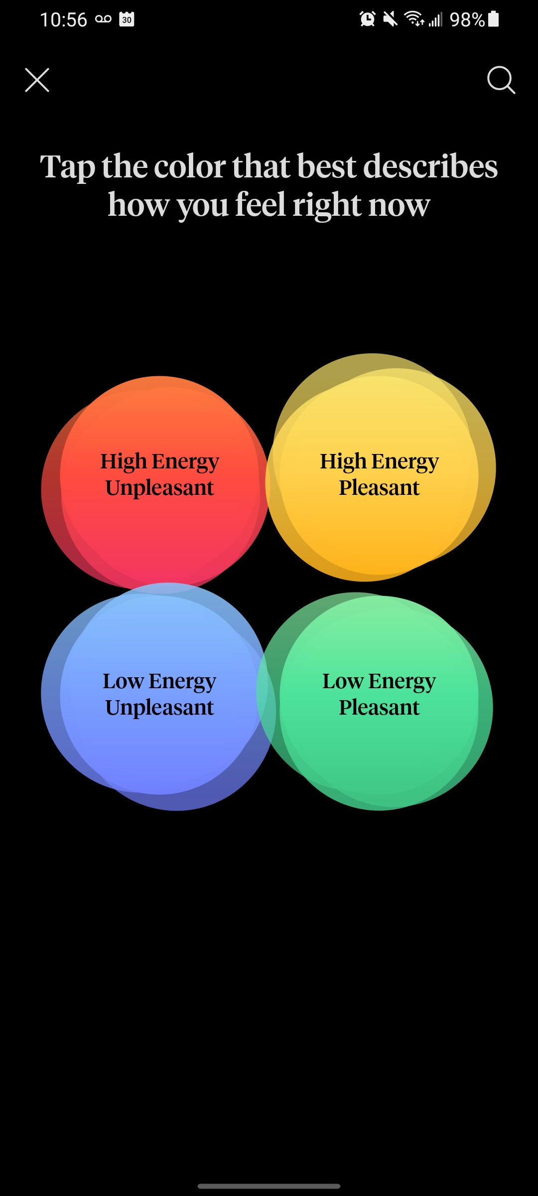
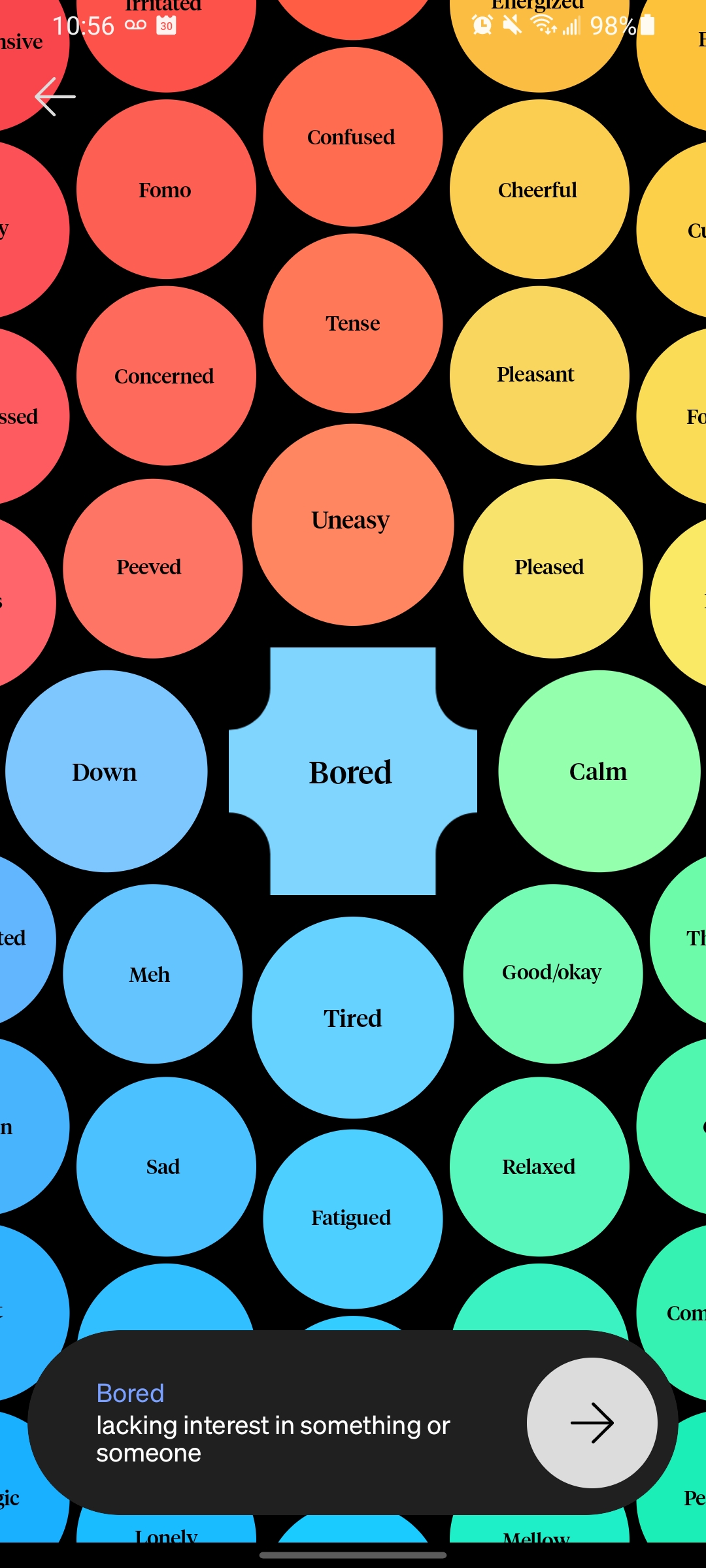
Visualizing the users & their experience
I created a constraints map, which helped me process and consider a wider range of realistic limitations users may face while participating in a meditation session using the app.
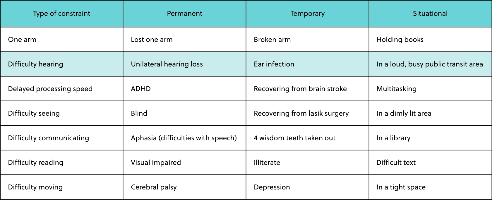
Constraints map
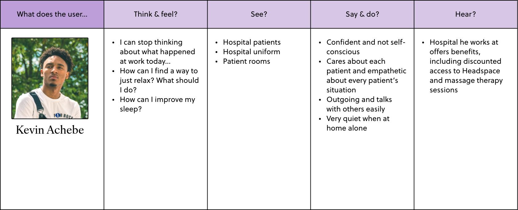
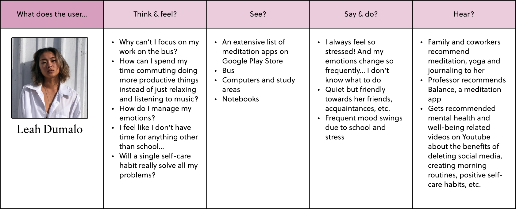
I used this constraints map to create three personas, each with different constraints as well as strong goals and motives that reflect the findings from the triangulated research.
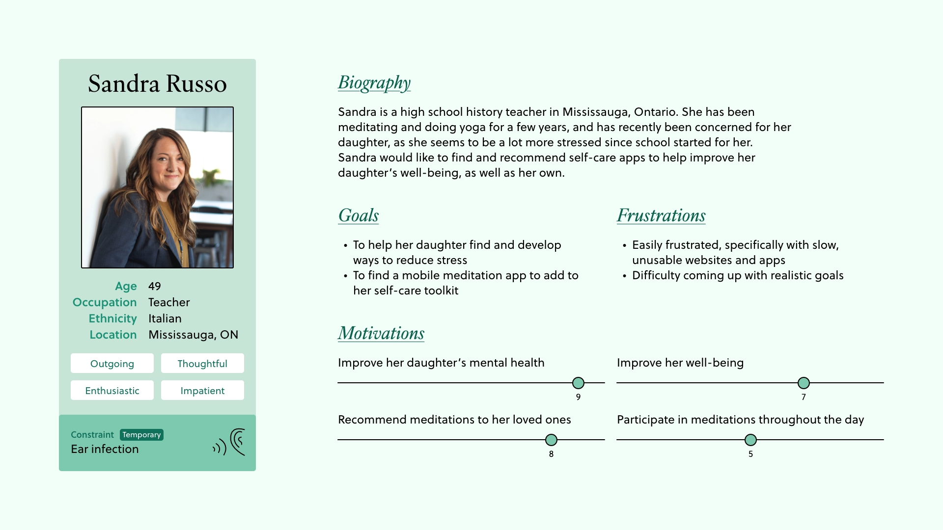
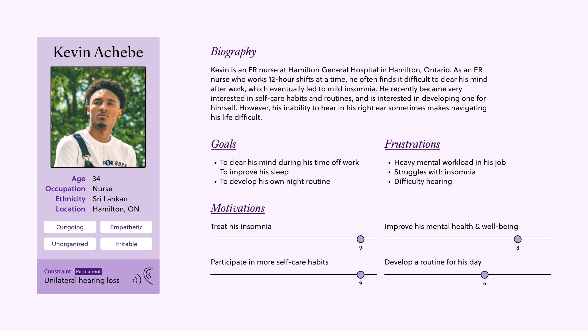
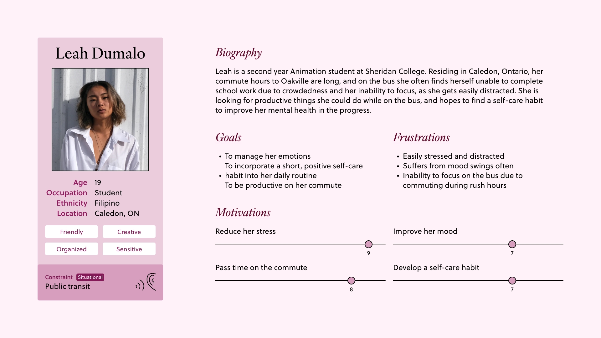
Personas
The goals, motives and constraints in these personas emphasize the importance of three characteristics in a meditation app: effectiveness, accessibility and enjoyability.
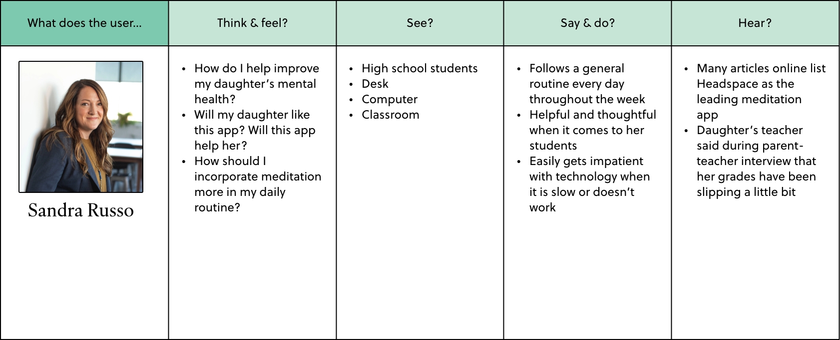
Empathy maps
These empathy maps acted as a general outline for the context scenarios that were eventually created for each persona.
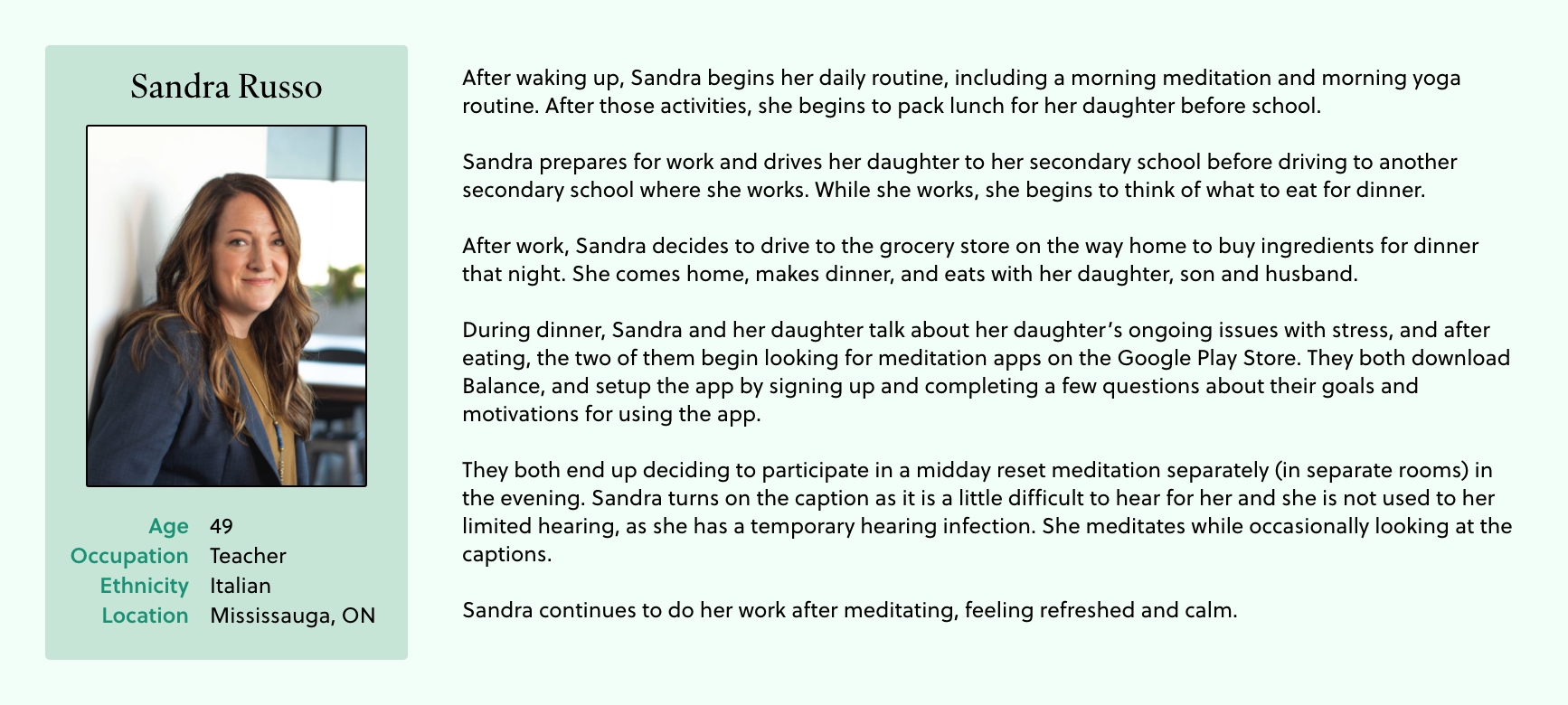
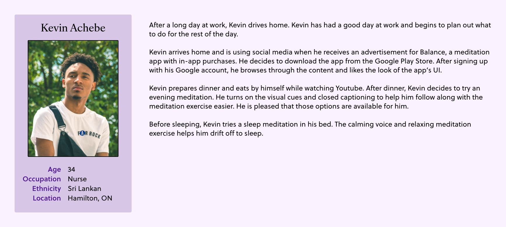
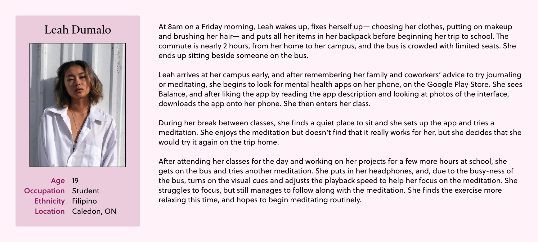
Context scenarios
Defining the key functionalities
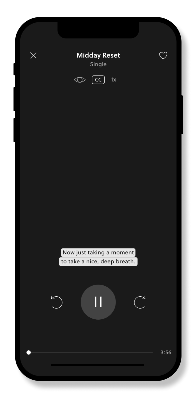
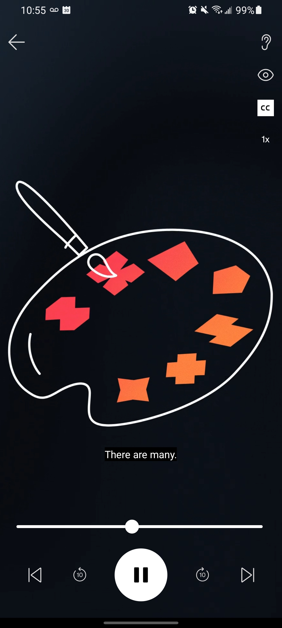
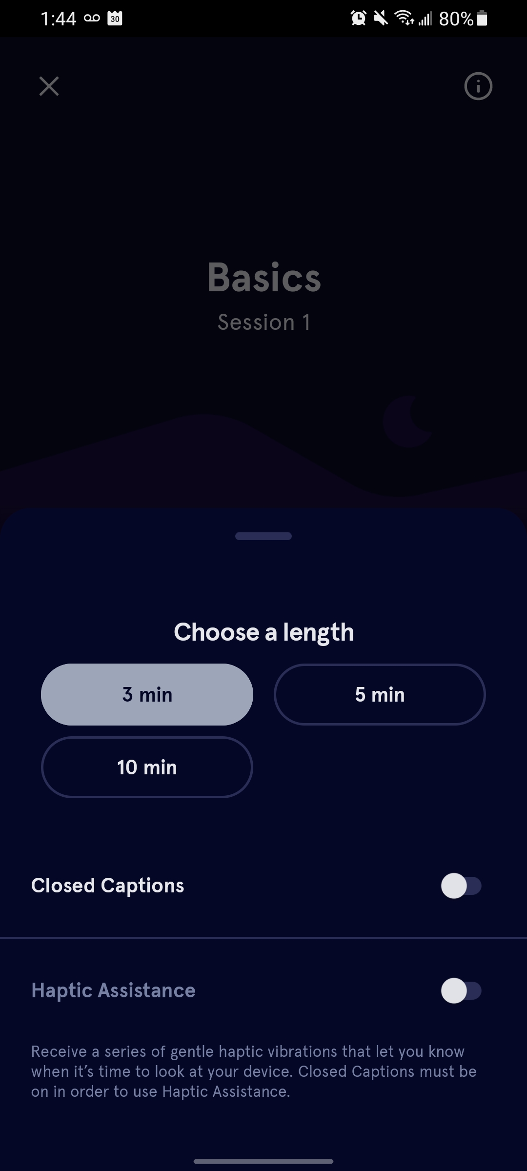
Here, I decided that I would add three new features to the app’s meditation sessions which would improve its accessibility to hearing impaired users, as well as improve the enjoyability of the app overall.
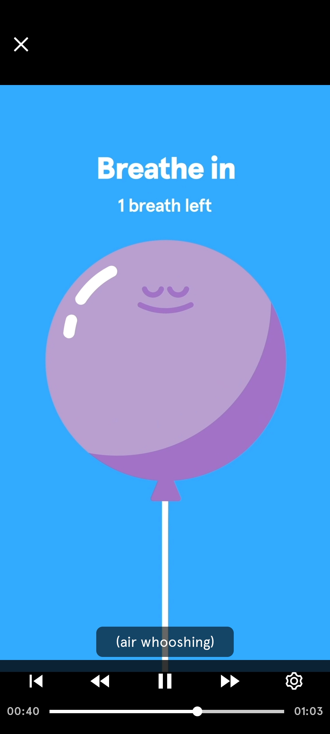
- Closed Captioning: Allow users to participate in a meditation visually without sound, greatly benefiting those who have hearing limitations or impairments. It could also help increase focus, which would allow users to understand and comprehend the content easier.
- Video: Meditation-related visuals that enhance the meditation experience, improving the overall interactivity and quality of the app’s content.
- Playback speed: Improve the user’s focus and attention. This feature also improves the accessibility of the app to those with difficulties processing information, allowing users to customize their listening experience by changing the rate at which information is displayed.
To formally describe the ‘whats’ that this redesign of the app would feature, a design requirements chart was filled out from the perspective of these three personas. Creating design requirements further defined the issues that would be solved through these new features, and helped solidify the functionalities that the app would need to satisfy the users’ needs.
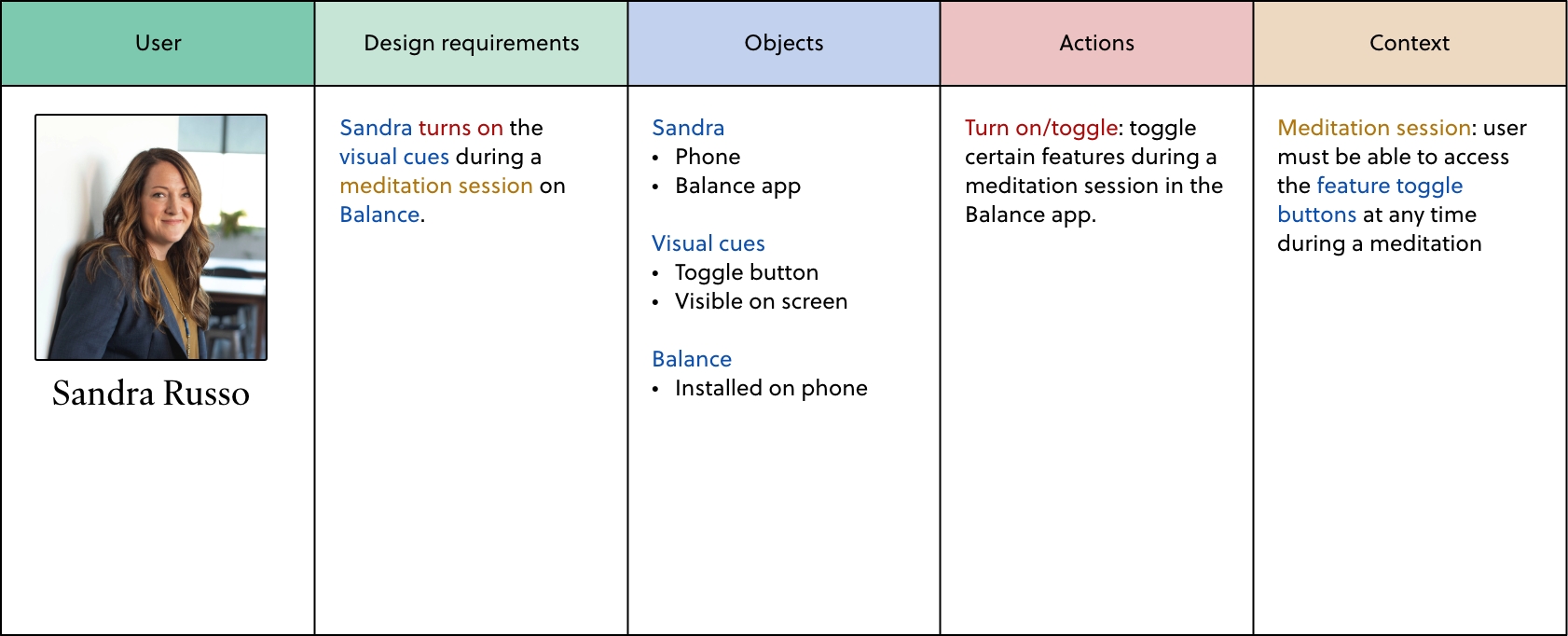
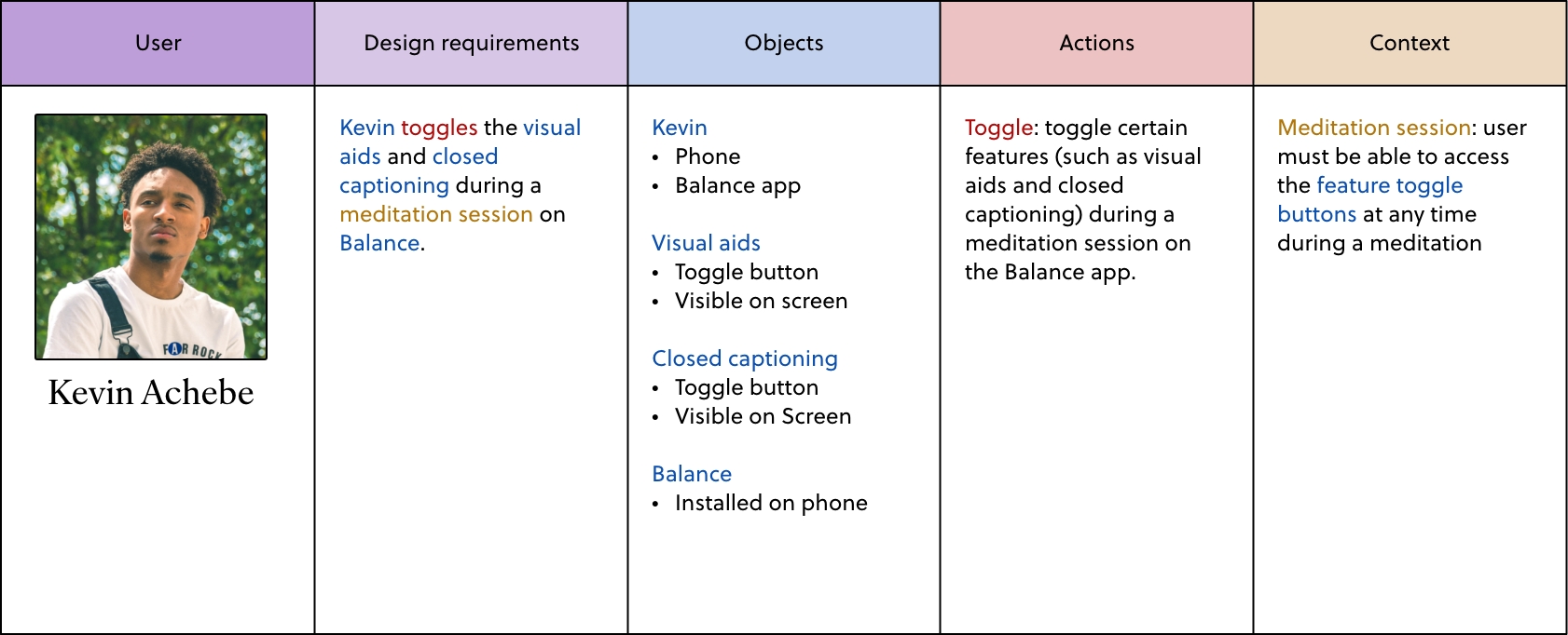
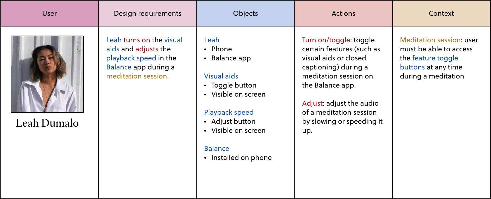
Design requirements. Each design requirement references the action each user did from the context scenarios.
However, it is still crucially important to recognize the pain points these personas may face while using the app, even with these new features in mind. After reflecting on the key features that I had outlined in my design requirements chart and the narratives I had built through the context scenarios, I created three user journey maps. It was easier to finally understand the perspective of the users from all angles, and the pain points they face in their user experience.
04 - PROTOTYPE, TEST & ITERATE
Creating the prototype
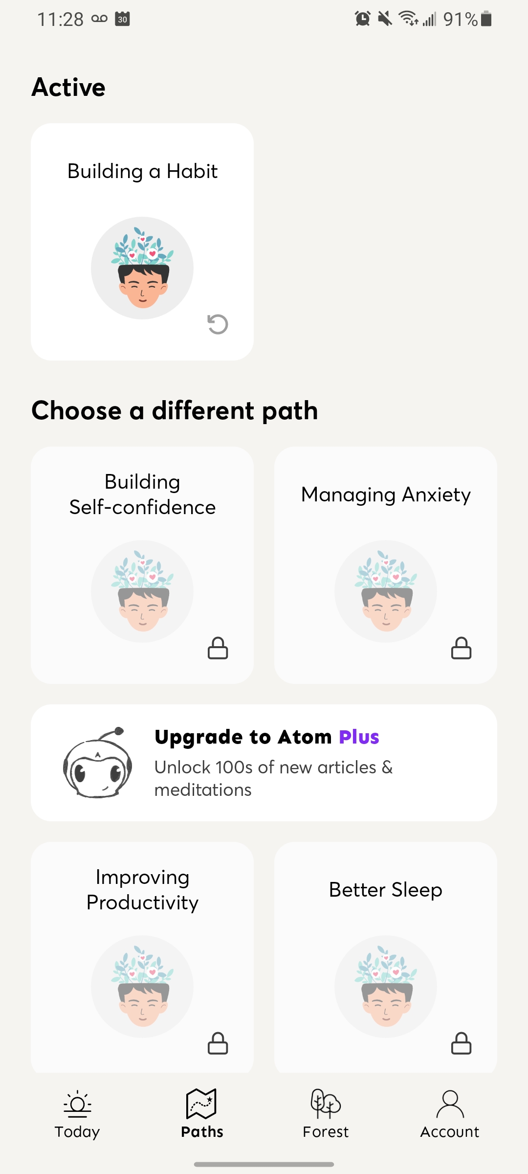
I created low-fidelity wireframes of the app’s new interface using the current app’s design as a reference point. Most screens stayed the same, with the exception of the meditation session page, where I added three icons for the three new features.
After that, I conducted multiple user tests on the low-fidelity wireframes using three task scenarios that incorporate the usage of these new features as part of their user journey. I learned that while users initially found the app’s naming conventions confusing and unclear, they eventually found it easier to use the app once they had experience with the product. Through pre-test and post-test questionnaires, I learned that users also felt that using the meditation session’s new features were relatively easy and straightforward.
05 - SOLUTION
Style guide and final prototype
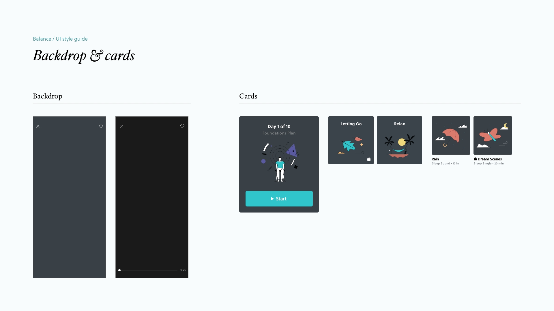
Following the user tests and before developing a high-fidelity prototype, I created a UI style guide of the brand’s existing visual design. This helped visually organize the app’s brand design, and create icons that were visually consistent with the app’s existing look.
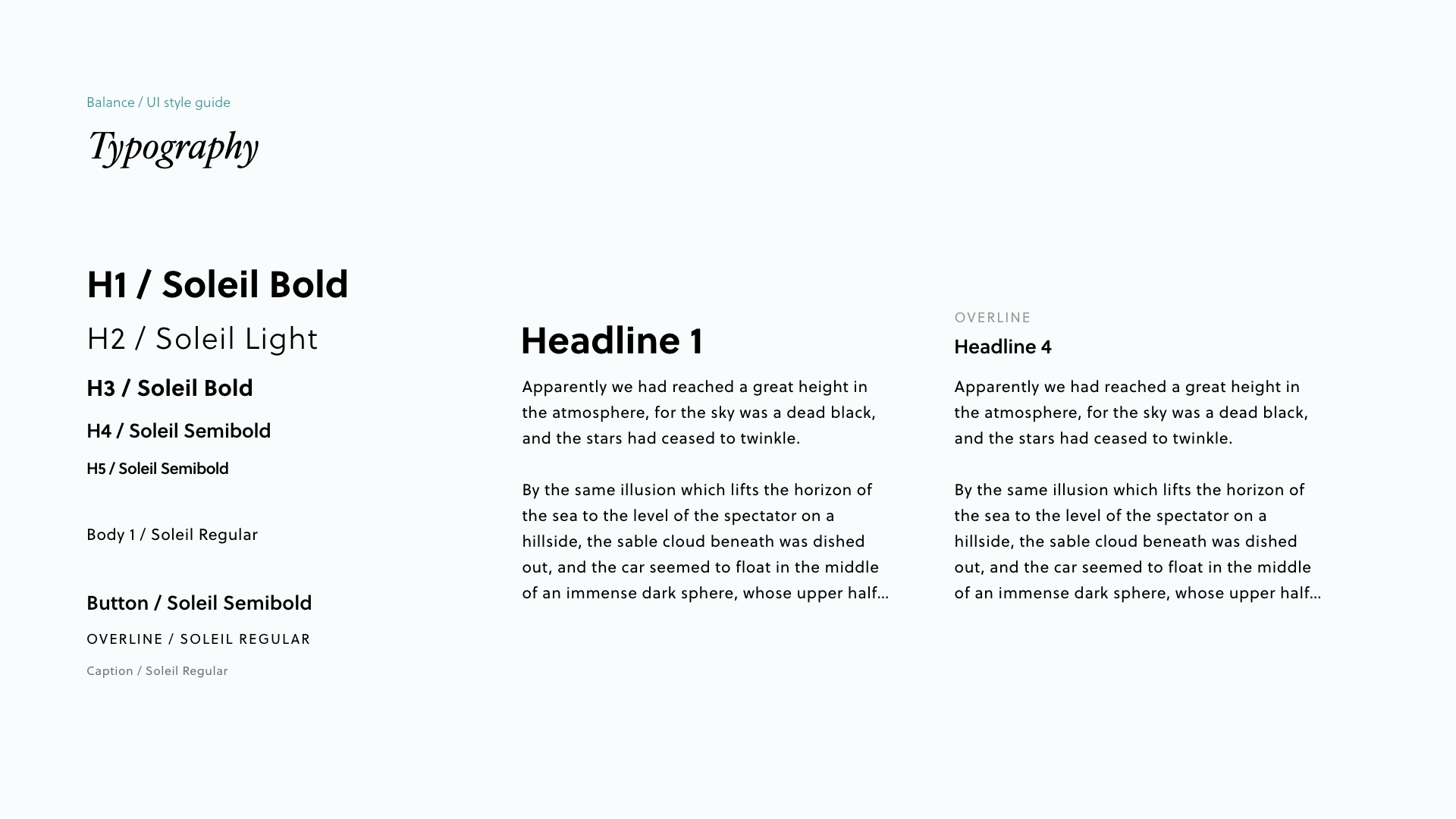
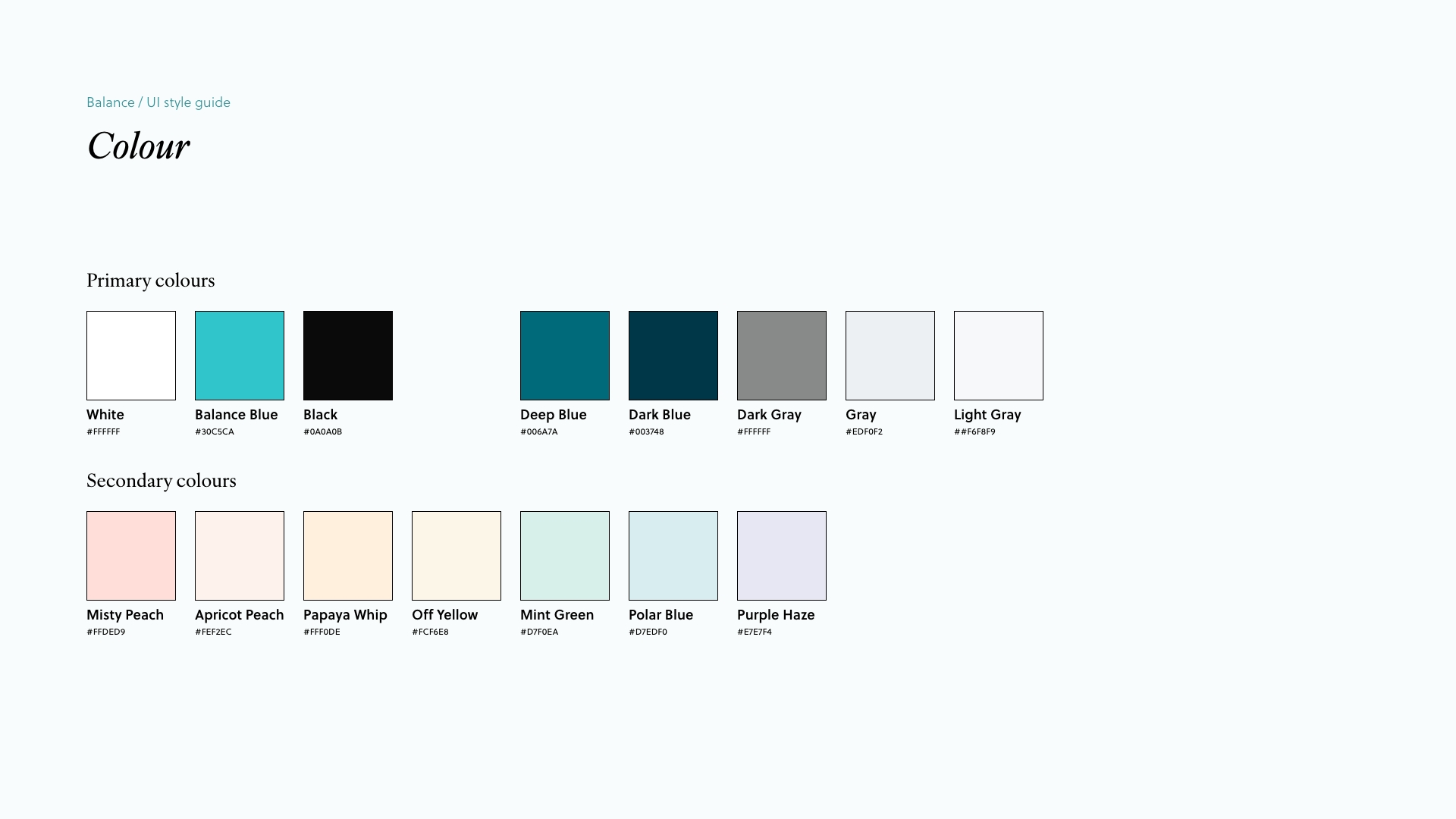
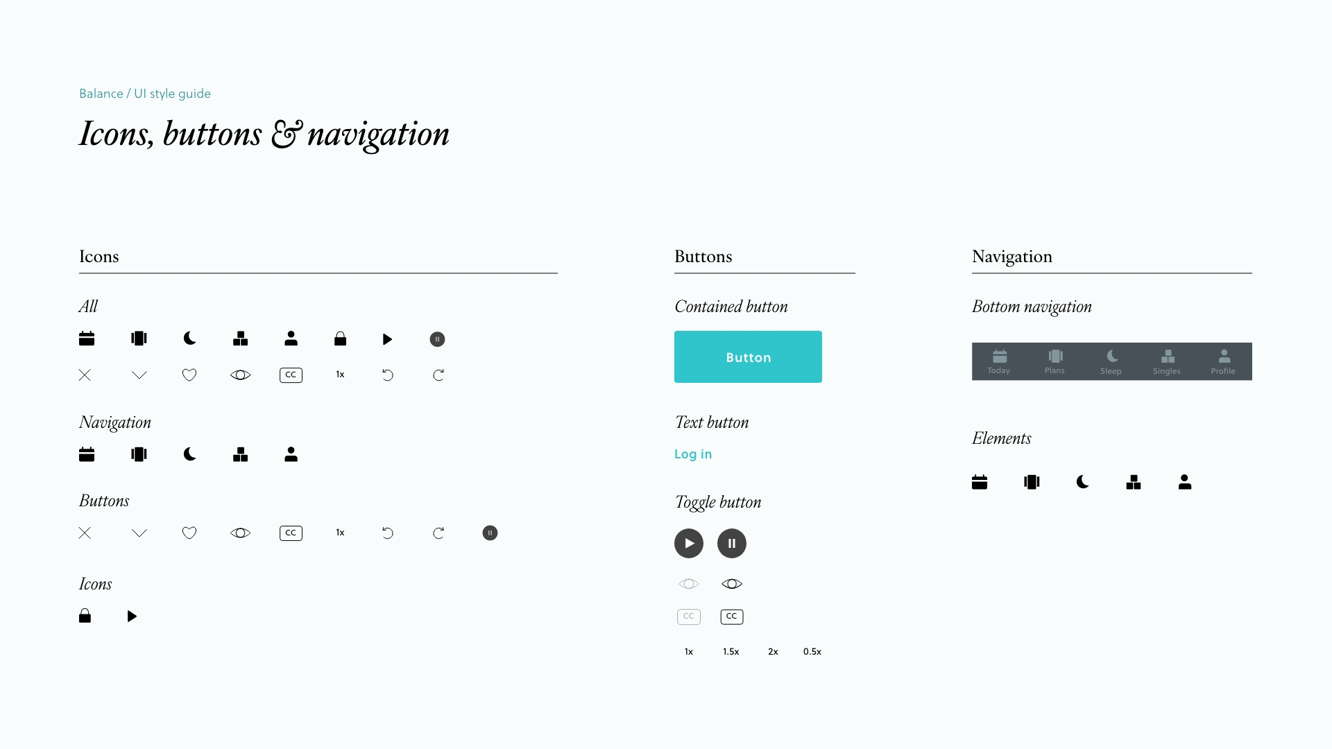
UI style guide
The eye icon (for video), CC icon (for closed captioning) and 1x text (for playback speed) were finalized and chosen to represent the new features, and high-fidelity wireframes were created.
Illustrations souced from Balance's interface as of 2023.
06 - NEXT STEPS
Closing reflection
This inclusive design project taught me an important lesson regarding the ethics of design: that is the responsibility I have as a designer to create products that are not only visually appealing and usable for the main demographic, but also accessible and inclusive of everyone.
I also think it’s important to not overlook the empathize and understand phase of any design project, as it is crucial to have a deeper understanding of the range of users I am solving for, in order to feel confident moving forward into the following stages of the project, and to create a design that truly addresses and solves the issue at hand.
Copyright © 2024 Marina Au.


